
REBRANDING JV STUDIOS
An inside look into the redesign of JV Studios, a creative video production & photo agency.

JV Studios is a creative video production & photo agency providing a tailored approach for your company’s unique needs. After launching the business in 2012, our style of work and ways of running the business continued to evolve, but we stayed true to our identity. By early 2016, we set out to rebrand JV Studios to feature our family roots. As we continue in 2023, our processes, portfolio, and story called for an even fresher look with a targeted meaning.
RE-EXAMINING OUR IDENTITY
Over the years, we worked closely with our graphic designer, Adam L Design, who helped curate our new brand pillars. The three pillars of JV Studios best summarize the brand as a whole and personify the desired tone. These pillars all act as individual pieces of the structure that come together and encompass what JV Studios is all about.

1 — PASSIONATE
We were put here to create. Our passion for creativity is not only in our work but in the fabric of our lives. The itch to explore unique solutions that tell every story in its own, unique way burns deep. This is what keeps us driven.
2 — AUTHENTIC
We wear our hearts on our sleeves. The character we've built doesn't change. This creates a genuine connection with whom we work. This forges warm relationships and adds to the purity of our work.
3 — PREPARED
We stay true to our process. Each and every challenge we accept warrants undivided attention from our team. From project kickoff to file delivery, our process has been refined for ideal productivity and efficiency. Throw it at us, we're ready for it.

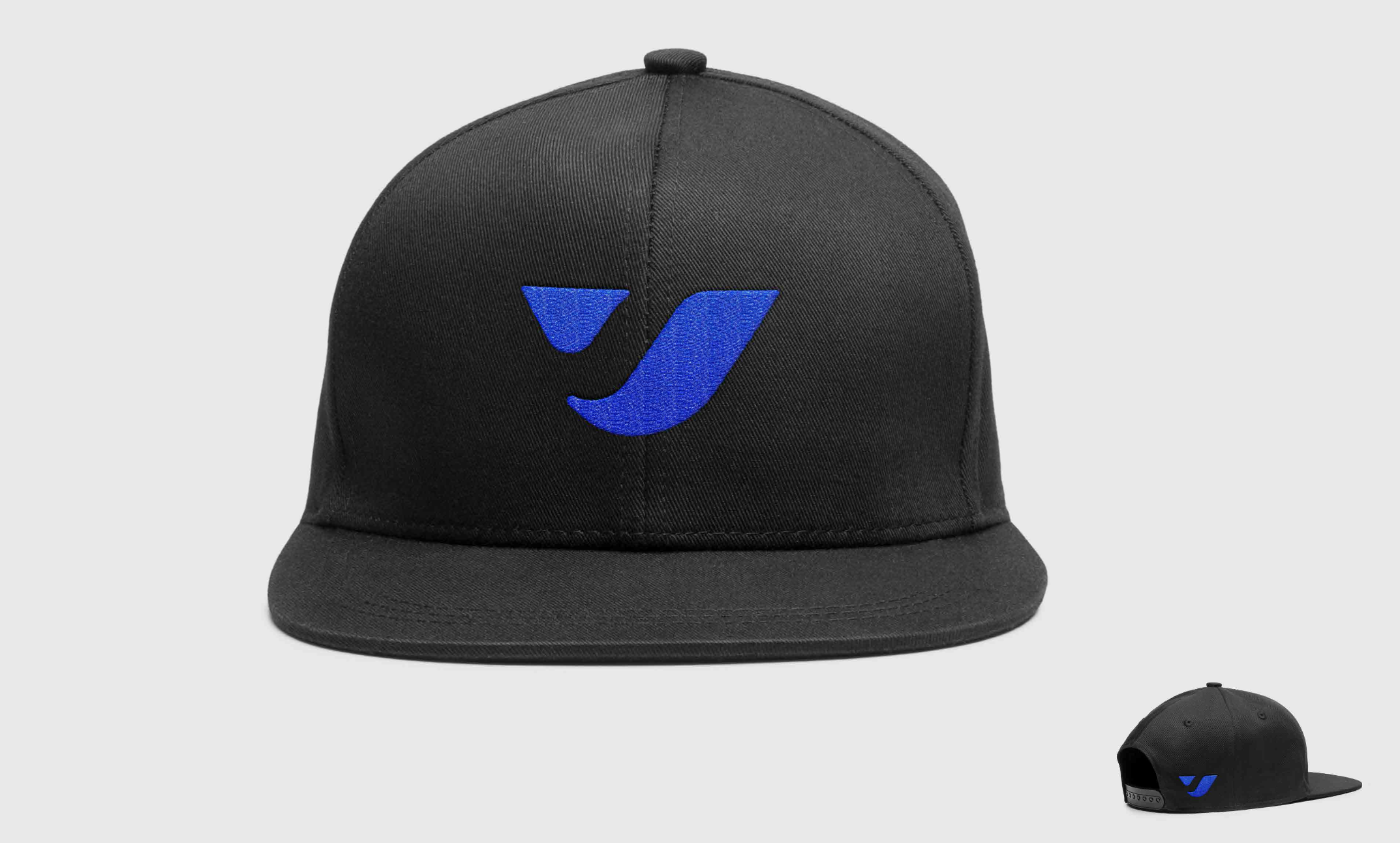
BEHIND THE NEW LOGO
Since our company was founded by John and Vince Pinto, keeping the “J” and “V” elements was very important to us. The new JV Studios logo is a visual play off of a combination of the letters ʻJʼ and ʻVʼ and takes a different direction from the current logo.
With the idea of JV Studios’ call to action pulled from the website: ʻLets set things in motionʼ, our designer Adam, wanted to give the proposed logo mark a dynamic feel. This differs from the sharper rigid structure approach of our past logo, but still carries a certain weight and commands attention.


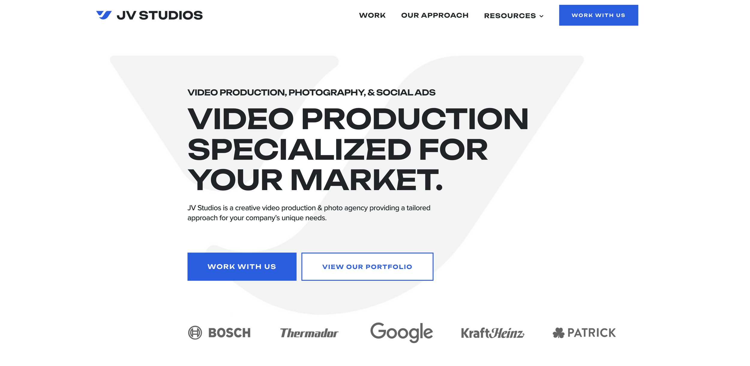
THE USER EXPERIENCE
When approaching our new website, it was important for us to consider the experience of a prospective client, but most importantly, it was important for our website to answer our client’s questions with the new elements we created.
We used elements such as the hover effect as an interactive tool to enhance the user experience, We also implemented case studies for all of our projects to let our viewers go in-depth into our process, workflow, and how we created the result.
Finally, we changed the voice of our website to have a more personal feel and connection to better understand the people behind the JV Studios brand.
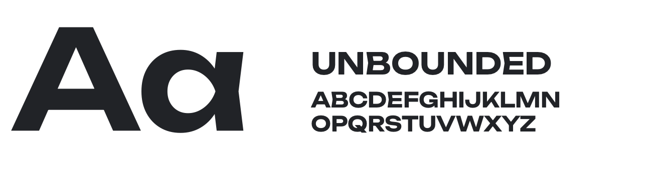
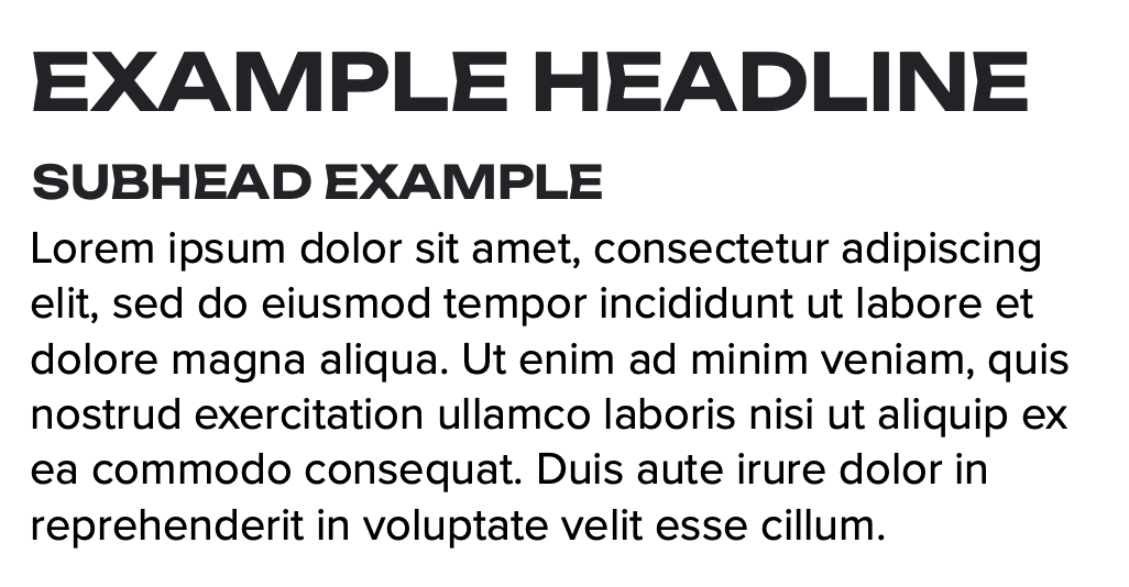
A TYPEFACE THAT IS UNIQUELY JV STUDIOS
TYPOGRAPHY
Distinctive forms and unconventional details of the headline font Unbounded are as disruptive as the movement that inspired the style of the font itself. Using this font comes with a bold approach to the style of work and projects we like to produce. We sought a font that can evoke an emotion and feeling when packaged together in a stylistic way, and we felt our new typography choice met that need perfectly,
The process of finding the right font takes time and we enjoyed seeing how a seemingly small change impacted the feel of our company. This typeface in particular feels fresh and modern, which was important to us. Ultimately, it illustrates the confidence and experimentation we have as people and want to convey in our brand.
A COLOR PALETTE INSPIRED BY FLUIDITY
The importance of color and accent positioning is everything when it comes to a website. When you first open a site, your eyes take in the color and shapes of everything, which influences how you perceive the brand. When it came to JV Studios, we were ready to brighten our look and feel. Although we chose to stay in the blue family, our approach to making our main accent color a brighter blue felt like a breath of fresh air or a representation of the flow of pure water. The way the colors coincide together with the layout of all the elements makes for a more impactful experience for the viewer.
PREVIOUS COLOR PALETTE
2016 — 2022
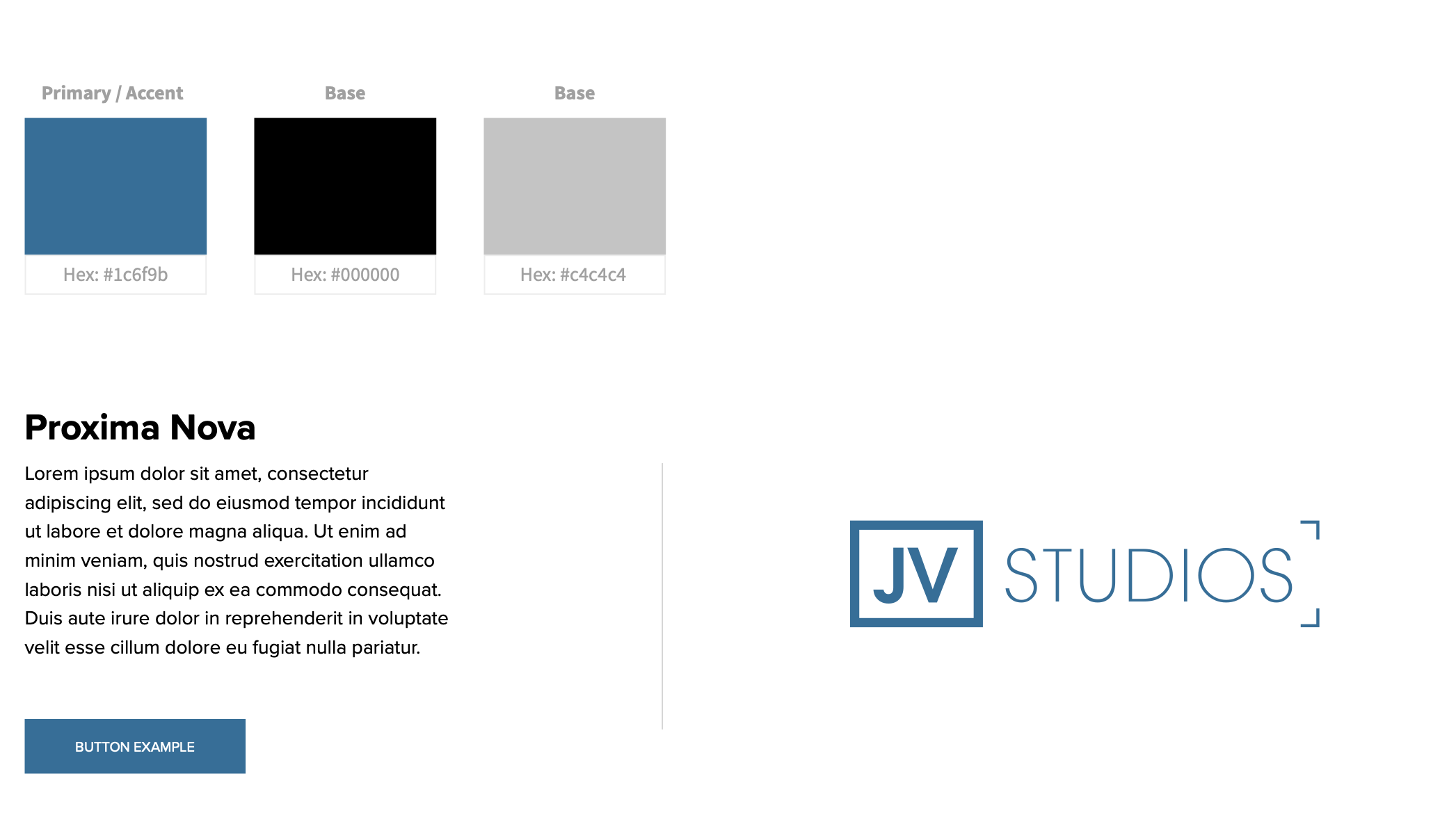
Our past colors evoked a more desaturated look
CURRENT COLOR PALETTE
2023 — PRESENT
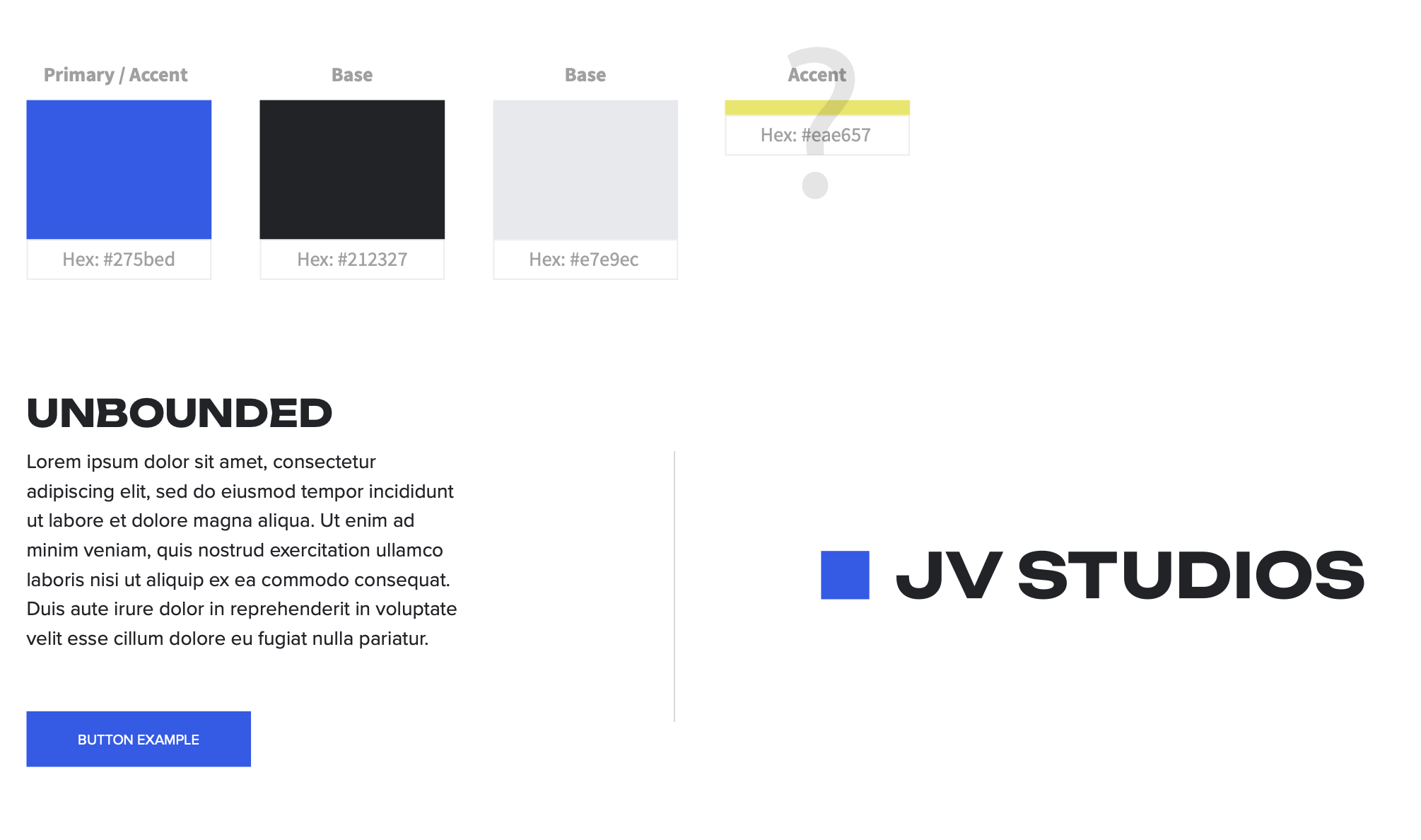
Our new colors illustrate bold and professional
CHANGE IS GOOD
A true value of our company is that you must be open to change to be successful. It’s even more important to understand what your business represents as a whole and how your brand positioning can shape and attract your desired clientele. Working with Adam L Design on our rebrand was a true joy and an exact demonstration of how to keep your brand relevant in today’s ever-changing industry.
We are excited to share our new look with the world. Thanks for joining the JV Studios story!